
The shops, even when small, even when dingy, had big, bright signboards, many-coloured, inventive, accomplished, the work of men with feeling for both Roman and Sanskrit (or Devanagari) letters.
V.S. Naipaul, India: A Million Mutinies Now
In heavy tones of black or multicoloured hues, hand-painted signboards dot the Indian roads. They form the language of the street, appearing as road signs, place names, advertisement billboards, commercial signage over shops, and public buildings. The eye automatically seeks the sign to gather information about our surroundings, yet we are so accustomed to their presence that we don’t usually pay heed to their history, makers and techniques of creation.
Street lettering is, hence, both pervasive and invisible. One of the earliest tools of outdoor advertisement, hand-painted boards serve two important functions: one, to offer information to a passerby, and second, to generate a sense of attraction for a good being sold or service being offered. In a marketplace full of competition, the sign painter must be creative with his technique to communicate the desirability of the object on sale and further, foreground the identity of the shop.
Although hand-painted signage has not historically been seen as an artistic practice, it is crucial to document it as important aspects of street graphics and vernacular design practices. The practice of street lettering and its evolution in India has not been sufficiently recorded and the names of many important sign painters and practitioners have now been lost.
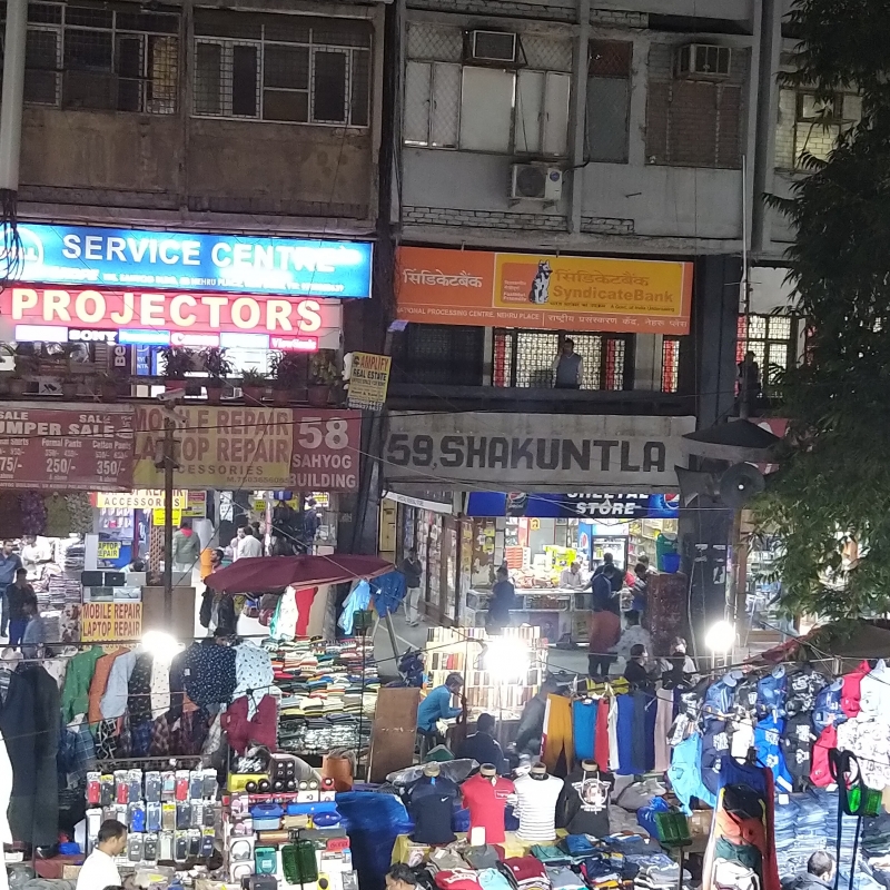
An increased demand for sign boards was felt in India at the beginning of the twentieth century, around the time of the First World War. Shortage of imported goods encouraged domestic manufacturers to produce and satisfy the local demand. This trend consolidated during and after the freedom struggle with its focus on the swadeshi movement and the ban on imports. The spirit of nationalism gave momentum to the indigenous economy and a range of new local ventures opened up. Simultaneously, a flurry of new signboards appeared on the landscape as advertisements. (Fig. 1)The signboard painter emerged as the local designer who could advise on aspects of marketing one’s trade through lettering, colours, and illustrations. Often, there was a collaboration between the shop owner and the painter to create these signages, since the illustration of the trade name was not only a practical necessity but a means of projecting the uniqueness of the shop and the type of business represented.
The Sign Painter and Their Vocation
The sign painter, or sign-walla as they are sometimes called, usually work from small stalls on the sidewalks. The profession is made up of people from various backgrounds and not associated to a single caste: erstwhile engravers, calligraphers,[1] people with a steady hand and flair for writing as well as art school graduates. Many iconic Modernist Indian artists, like M.F. Hussain, Allah Buksh, and G.R. Santosh had humble beginnings as signboard painters. Often people pursuing other vocations shifted to sign painting since it was a flourishing vocation till the late ’90s. With a fluency in multiple script traditions, particularly Nastaliq, Devanagari and the Latin languages,[2] the painters contributed majorly to the culture of street graphics. The colourful election campaigns, automobile number plates, the splendidly coloured trucks and buses all employed the skill of the painter. In the late ninteenth and early twentieth century, stage backdrops for theatre productions and cinema promotional material like banners and posters were hand drawn by the painter. For a generation of moviegoers, it was the manually designed posters with their lavish illustrations and attractive title designs that created the first impression of the releases. After the advent of digital technology in the ’90s, this practice started declining. To tackle such diverse client needs, dozens of large studios with painter artists opened across most cities while the small towns had their own established sign writers. These separate modes of visual expressions began to impact one another in aspects of colour, composition, style, and typeface.
Contrary to the contemporary printed flex advertisements, hand-painted signboards are not designed on a studio machine, but created on site, taking into account all the conditions of the location like the amount of light the spot receives, the signages that surround it, and the feedback of the passerby. Painter Kafeel, in his studio located close to Jama Masjid, New Delhi, recalls during an interview how in the ’70s, painting sign boards was an ‘interactive’ enterprise. Crowds would gather around a sign painter in action, applauding the strokes and often give feedback on the work that the painter would incorporate in the final design. The signboard is then not only limited to a commercial object but is an inventive craft tradition that gives space to localised tastes and understanding of regional aesthetics. Including the element of improvisations, hand-painted lettering employs a rich variation in style, embellishment, and painterly enhancements that render the simplest of trade names into an iconic representation.
Influences on the Letterforms
Signboards across the national capital region of Delhi are multilingual, often employing the official languages, Hindi and English. However, there are road names in certain neighbourhoods in Urdu and Gurmukhi (script of Punjabi) as Urdu and Punjabi were recognised by Delhi as the second official languages since 2001. Other scripts such as Pashto can also be encountered in the Afghan precincts of Saket, South Delhi or the multiplicity of Hebrew, Russian, Korean and Bengali signages in the winding lanes of Paharganj, Central Delhi. Shop insignia contribute to this linguistic landscape and depending on the locality and the prospective clientele, shopkeepers use a single language or a combination of languages. The perception of English or Latin script as more ‘modern’[3] influences the choice of shop hoarding with many trade names written either exclusively in English or in tandem with another language that the product is culturally or ethnically associated with.[4]
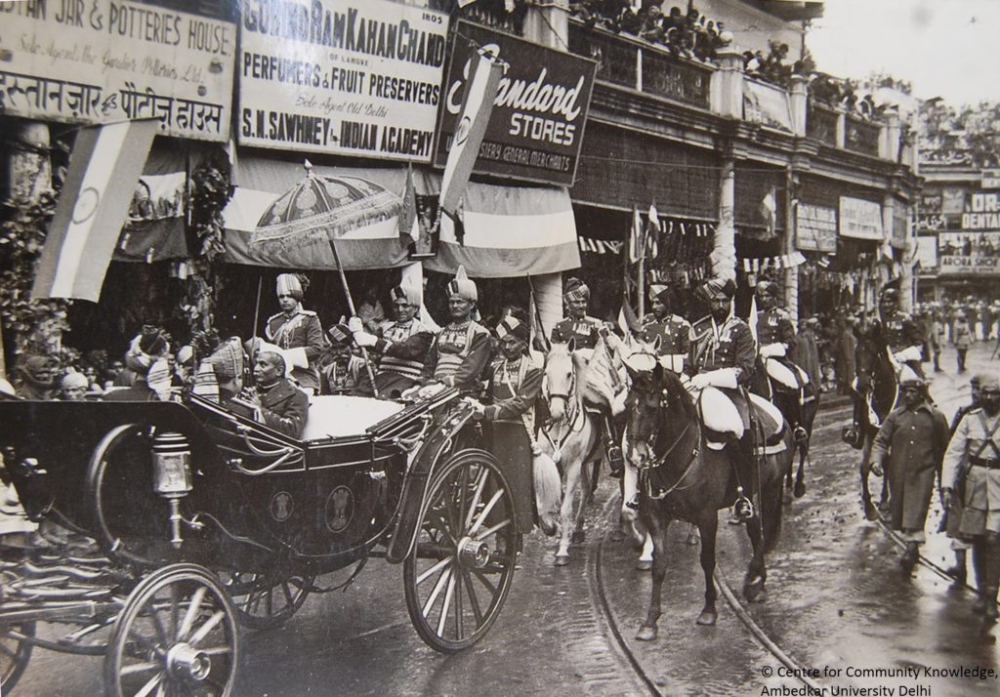
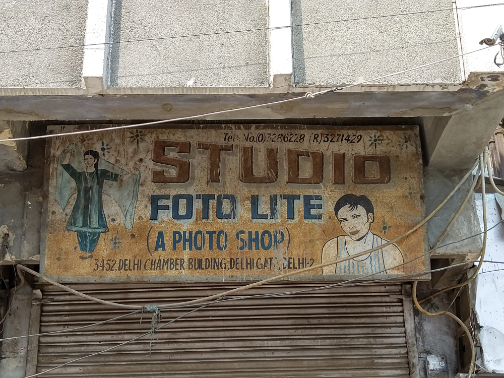
Some of the earliest influences on Latin signboard letterforms came from existing print culture of the time. Foreign magazines were referenced for latest trends and the classified advertisements in newspapers often disseminated popular typefaces, ranging from the opulent Blackletter, rounded serifs, and the sleek sans serif. The early signboards would often contain both visual and textual elements, or a combination of drawing and lettering to make it more accessible for non-literate customers. (Fig. 2) The gun decorating the signboard of an ammunition dealer, the cult Bollywood portraiture painted on saloons to indicate grooming, the rippling muscles of the bodybuilder to promote personal trainers, or the big rounded glasses adorning the shop fronts of opticians were indicators of trade. Further, as discussed by anthropologist and art historian Christopher Pinney, ‘pictorial advertisement’ was deemed essential in India where ‘goods intended for popular sale ought to be marked with some distinctive pictures which could be easily remembered.’[5] Gradually the practice of complimenting the trade name with a lively illustration fell went out of fashion; by the ’90s, many signages did not need accompanying pictures.

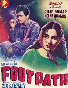
Another dominant influence on commercial signboard aesthetics came from the visual language of cinema posters. Before the popularisation of digital printing, posters were either hand painted or created through the cut-paste collage technique prevalent in the ’70s with the widespread use of still photography.[6] Painters borrowed the stylistic techniques used in cinema posters, particularly in matters of typeface layout, colours, and composition to create striking shop signs. (Figs 3 to 9) A prominent feature of hand-painted signs in India is its expressive three-dimensional letterforms that finds an interesting parallel in the practice of title design in cinema posters. (Fig. 3) From the 1950s to the ’80s, there was a surge in the use of 3-D lettering in titles, memorably in films like Mughal-e-Azam (1960), Sholay (1975), Mukaddar Ka Sikandar (1979), Razia Sultan (1983).[7] Shop signs across Delhi streets reveal a fondness for techniques like shadows and multiple layers of paint to infuse the trade name with a sculptural quality that seems to protrude from the surface of the board. Lettering in Bollywood posters had a stylistic impact on the signboard aesthetics as the painters implemented the techniques of perspective and three-dimensionality on commercial signage.


Ira Raja from Delhi University, Department of English and Ken Botnick, a publication designer and Professor of Art at Washington University, Saint Louis, state that ‘three-dimensionality remains a distinctive aspect of the visual cultures of South Asia not to be found in the use of comparable media elsewhere.’[8] A simulation of depth is achieved by the painter through shading techniques and experiments with perspective. Whether on cinema posters or on a local telephone booth, letters are augmented with a layer of colour under them to make the message more prominent. According to the designer and typographer Itu Chaudhuri:
The lettering produced by street artists in North and West India was based on simple geometric constructions, which could be reproduced reliably by apprentices. Such artists were not after calligraphic excellence. The focus was on decorating the letters with colours, shades and rendering them three-dimensionally, to stand out as well as to imitate signs made of wooden or metal letters.[9]
A striking genre of three-dimensional lettering can still be seen on juice stalls and ice cream stands in Delhi, with their multi-coloured fluorescent lettering with contrasting highlights and shadow effects. Technically termed as beveled prismatic lettering, the design involves intricate lines and triangles drawn within the sans-serif typeface, which are then illuminated with colours. The Delhi-based juice banner devised by Charan Painter, who once worked on expansive Bollywood cinema hoardings, brings together as many as seven separate colours within a single letter. Popularly referred to as the satrangi (seven colour) style, to design it, Charan took his inspiration from the Raleigh Bicycle Company logo.[10] Balancing seven shades harmoniously requires an intimate conception of colours and a knowledge of mixing paints to create the precise tone. The juice banner would feature a Bollywood superstar holding a glass of fruit juice or a stack of sugarcane sticks to enhance its appeal. Sign writing often employs a mix of styles, juxtaposing tilted letters with flowing calligraphic scripts or straight serifs, which communicates different aspects of information such as grandeur in the trade name and more practicality about the location and contact details.
Rising Competition in the Signage Industry
The ’70s was an exciting time in the Indian signage industry as new fashions and formats started entering the market. Illuminated signs, incandescent backlighting, and handcrafted neon tubes with their luminous glow started emerging in the prime districts of cities. While the glamour of these signages was undeniable, they did not present any worrying competition to the clientele of the hand-painted sign maker. Electric signages were expensive and only enterprises like jewelers, hotels, or premium theatres could afford the embellishment of glow signs to prove business strength and power.
A movement towards cutout letters made of chiseled wood and metal alloys started making inroads in the ’80s giving signage an embossed appearance. New mediums were being explored and in the same decade acrylic sheets replaced the tin boards. According to the scholar Gaurav Mathur, this allowed existing professionals like electricians, engravers, and metal cutters to find a new relevance within the signage industry. The sign painter continued to thrive, finding patrons in sectors which did not have the budget for these novel innovations. Two separate developments in the ’90s eventually marked the gradual decline of hand-painted signage.
Decline in the Practice of Hand-painted Signages
In the early ’90s, the Indian economy was undergoing sea changes. The economic borders were opening up and liberalisation brought in foreign companies eager to invest in the nascent free market. Hulk Hogan versus Rock beamed on cable television, Kellogg’s became a breakfast option, and Nescafe reached the neighbourhood stores. Around this time the beverage giant Coca-Cola reentered India after discontinuing its business in the late 1970s. Their marketing strategy was to enable maximum visibility of the brand in public spaces. Abraham Ninan, former head of external affairs Coca-Cola India recalls how partnerships were struck with local shops and kirana [grocery] stores to publicise their products.[11] Noticing that India lacked the technology to swiftly mass produce signboards: silk screen printing, vinyl cutters, and large format digital printers were imported. Coca-Cola company as well as many cigarette brands offered the shopkeeper a free signage that would carry the trade name along with the corporate logo. The promise of a free signage convinced many shopkeepers, and the cursive script of the Coca-Cola logo began to emerge in all quarters, from tea stalls to grocery stores. The standardised, corporate-donated free signboards reached even the small towns and remote areas and the sign painter was the collateral damage in this competitive advertisement tactic.
The handwritten sign was gradually marginalised and commissions began to dwindle. The culturally rooted vernacular styles were shadowed by the machine-made, mass produced signages. (Fig. 11) Further, the local design community of sign painters were also impacted by the rising popularity of digital printers, vinyl cutting machines, and editing software at the beginning of the twenty-first century. Digitally created signage became cheaper and more quickly delivered than hand-painted writing. With the business not as lucrative as before, many sign painters have been forced to seek other sources of income to earn their livelihood, and there is a steady decline in people training in sign painting. Some painters have adapted to the technological shift and taken to designing on a computer; while there is a recent surge of recognition for them within contemporary art circuits like the India Art Fair and among collectors overseas,[12] their presence on the street is subsiding.
Along with this competition posed by digital technologies, the late ’90s presented another challenge in the form of administrative attempts to discipline urban aesthetics. The idea forwarded by urban planners, consultant architects on city development projects, and the municipality was that a city is remembered through the visual characteristics of its streets, and there was a growing interest in the role of design in modernising our urban landscapes. The existing signboard culture that filled the streets and peeped from building tops was identified as chaotic and in 1993, the by-laws of the Delhi Municipal Corporation laid strict rules on various outdoor advertisements including commercial posts, hoardings, banners, electric, and handwritten signages on public streets, buildings, and structures. Regulations were imposed on the position, shape, size, and lettering style of signages as the Modernist planners found the existing signage culture unsightly for its idiosyncratic experiments with type and design. The proprietors of Naveen Tea House in New Delhi’s Gole Market informed how they redesigned their signage in the ’90s after receiving clear guidelines from the Municipality regarding size and style of lettering and the accepted background.
Joining the discussion on the image of the city, often urban planners foregrounded the need for orderly, supervised public spaces. The desire to tame the appearance of cities has been widely debated in particular by architectural theorists like Gautam Bhatia who regretted the ‘signs of commerce’ on top of buildings that blemished the cityscape.12 The question recurred again during the Commonwealth Games 2010, when the measures to make Delhi a ‘world class city’ included removal of its existing signage system. Commonly termed as ‘visual pollution’, old signs were replaced with new digitally printed signboards that had to conform to prescribed formats of size, shape and style or else suffer taxation.[13] This disciplining can be particularly seen around the Shankar Market and Tibetan Market of the central business district of Connaught Place, Delhi.
The impetus to achieve a harmonic visual urban design through an imposed control and management of signages caused a collateral damage to the sign painting profession as many of the old boards were replaced by homogenised designs on flex and the production of new signages by shopkeepers and retailers favour digitally printed types of uniform layouts with a neutral presentation. This standardisation of style erodes many of the vernacular forms of type expressions and future innovations, which do not conform to the modernist vision of the city. The notion that signboard culture ‘does not reflect the times we are living in’[14] overlooks the history, character, and identity of shops in the historical neighbourhoods of Delhi and imposes a ‘monotonous unity’.[15]
Conclusion and Future Research
When the conception of a beautiful city relies on visually sanitizing our environment, we put at risk generations of street typeface practices and the traditional knowledge of hand-painted lettering. It generates important questions regarding what a community and the city authorities believe a ‘world class city’ looks like and what parts of our culture we wish to leave behind to assert a new identity. Ira Raja and Ken Botnick in their in-depth essay locate sign painting within the Indian decorative arts tradition.[16] The authors point out that by ‘lumping all signage into an undifferentiated category of visual pollution, we lose the qualitative distinctions between the digital and handmade, and the different ways in which these contribute to our collective experience of the city.’ It would be important that along with the ongoing projects like Handpainted Types, an initiative that digitises, annotates, and preserves the lettering techniques of sign painters in India, researchers recover traces of old signages by accessing the Municipality Corporation or the Delhi Archives to study more accurately the evolution of design aesthetics. There is also a need to look more closely at the relation between a projected modernity of a city and the role of art within it, which drives the reformist desires of city authorities and its actors to eventually put at risk an age-old tradition of indigenous lettering.
Notes
[1] Painter Shakeel, a veteran artist from Old Delhi is one of the few painters who are proficient in Urdu lettering. His grandfather, Munshi Abdul Ghani, was a famed engraver of his times and had etched the entire Quran Sharif on a stone.
[2] Since this essay looks at sign painting in Delhi, Devanagari, Nastaliq and the Latin script are the predominant languages used in the region. Sign painters from other parts of the country have proficiency in several regional languages.
[3] Graddol, David. English Next: Why Global English May Mean the End of English as a Foreign Language.
[4] Ramanujam, The Linguistic Landscape of New Delhi.
[5] Pinney, "Photos of the Gods": The Printed Image and Political Struggle in India.
[6] Qureshi, Decoding the Bollywood Poster.
[7] Shahid, Bokil, and Kumar, Title Design in Bollywood Film Posters: A Semiotic Analysis.
[8] Botnick and Raja, 'The Unruly City: Signs, Streets, and Democratic Spaces.'
[9] Paul, ‘The Hand Typographers of India.’
[10] Selvaraj, ‘Sign of the Times.’
[11] Moye, ‘2 Decades Later: A Look Back at Coke’s Dramatic 1993 Return to India.’
[12] Dev, 'Sign Paintings: Cultural Inventions of the Highest Order.'
[13] Sharma, ‘City Scores Poorly in Sign Language.’
[14] Ibid.
[15] Ibid.
[16] Botnick and Raja, 'The Unruly City: Signs, Streets, and Democratic Spaces.'
Bibliography
Botnick, Ken, and Ira Raja. ‘The Unruly City: Signs, Streets, and Democratic Spaces.’ Thesis Eleven 113, no. 1 (December 2012): 94–111. https://doi.org/10.1177/0725513612456390.
Bhatia, Gautam. ‘Building an Ugly India.’ Seminar, no. 501 (May 2001): n.p. Accessed April 7, 2020. https://www.india-seminar.com/2001/501/501 gautam bhatia.htm
Dev, K. 'Sign Paintings: Cultural Inventions of the Highest Order.' 2013. Accessed December 17, 2020. http://www.kdja.org/wp-content/uploads/2017/08/india_press_sm.jpg
Graddol, David. English Next: Why Global English May Mean the End of English as a Foreign Language. London: British Council, 2006.
Moye, Jay. ‘2 Decades Later: A Look Back at Coke’s Dramatic 1993 Return to India.’ Coca-Cola India. June 12, 2013. Accessed December 17, 2020. https://www.coca-colaindia.com/stories/20-years-later-a-look-back-at-cokes-dramatic-1993-return-to-india.
Mathur, G. (2005). Signboards as Mirrors of Cultural Change. Design Issues, 21(4), 78-93. Retrieved April 26, 2020, from www.jstor.org/stable/25224021
Pinney, Christopher. (2008). "Photos of the Gods": The Printed Image and Political Struggle in India. Bibliovault OAI Repository, the University of Chicago Press. 10.2752/175183408X288258.
Paul, S. (n.d.). The hand typographers of India. Retrieved April 10, 2020, from http://www.sunday-guardian.com/artbeat/the-hand-typographers-of-india
Ramanujam , Meganathan. The Linguistic Landscape of New Delhi: A Precursor and a Successor of Language Policy. British Council , 2015.
Shahid, Mohammad, Prasad Bokil, and Darmalingam Udaya Kumar. “Title Design in Bollywood Film Posters: A Semiotic Analysis.” ICoRD’15 – Research into Design Across Boundaries Volume 1 Smart Innovation, Systems and Technologies, 2014, 291–301. https://doi.org/10.1007/978-81-322-2232-3_26.
Shahid, M., & Udaya Kumar, D. (n.d.). Retrieved April 15, 2020, from http://www.typoday.in/2017/spk_papers/mohammad-shahid-typoday-2017.pdf
Sharma, Manoj. ‘City Scores Poorly in Sign Language.’ The Hindustan Times, New Delhi, July 4, 2009. Accessed December 18, 2020. https://www.hindustantimes.com/delhi/city-scores-poorly-in-sign-language/story-85bCeEDBCccKAhTKy6ZMeN.html
Qureshi, Irna. ‘Decoding the Bollywood Poster.’ National Science and Media Museum, February 28, 2013. Accessed December 1, 2020. https://blog.scienceandmediamuseum.org.uk/decoding-the-bollywood-poster/.