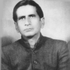
Professor Sudhakar Nadkarni is a pioneer in design education in India. He introduced the first postgraduate design programme in 1969 at the Industrial Design Centre (IDC), Indian Institute of Technology, Mumbai, and later helped establish the Department of Design, Indian Institute of Technology, Guwahati. Along with his academic and institutional engagements, he has also closely worked with legends like Charles Correa and Pupul Jaykar. He is presently the Professor Emeritus, Business Design, Welingkar Institute of Management Development and Research.
Following is the consolidated transcript of the interview conducted over email exchanges in the month of December, 2019.
Chandrika Acharya: We know about your pioneering contribution to design education in India. Could you tell us about how you started your hand painted signage practice during your formative years?
Sudhakar Nadkarni: It started in the chawls in Mumbai, a low-cost housing system built in the 1900s, which was the cultural hotbed for the upcoming middle classes. I grew up in one such chawl in central Mumbai. Gangadhar Nivas was a chawl of 52 rooms, each divided into a living space and kitchen space. In this modular system, living space became bedroom for kids and seniors in the evening and the kitchen was typically reserved for the married couple. Other family members took shelter on the terrace.
The terrace was an important place for all the inhabitants of the chawl. It was the epicentre for interactions; lovebirds twittered, children grew up flying kites, housewives used this to sun-dry snacks, and so on. The most important of all these activities on the terrace was the annual cultural show. Every resident of the chawl looked forward to this event with great excitement. The chawl would suddenly become charged with energy during the preparation of this event. The feature attraction of the cultural evening was always an elaborate three-act play. The planning started months[before] with the selection of the play. The most politically embroiled and contentious decisions involved the selection of the cast with a line of aspirational stars in the community. On the other hand, choosing a director was never an issue. I was known for having some artistic aptitude and was given the responsibility for publicity: creating posters for walls in the neighborhood. I would start my work about a week prior to the program with a bucket full of liquid chuna [calcium hydroxide] mixed with gum to give it longer life. I would coordinate a team of about four or five enthusiastic youths. We would paint an invitation to the program on the crossing of the roads nearby. We would like to believe that we were successful as we would have a full house. This is how I started my hand painted signage practice.
CA: Did you have a mentor to refine your hand painting process?
SN: I was fortunate to be mentored by our neighbor Mr Kamat. He was from Goa and would do beautiful calligraphy in Devanagari script. Mr Kamat would pin his cloth banner on a flat front wall of our room. Next, he would pencil roughly the text to allocate appropriate space to the letters. He would then take a brush and draw swiftly the letters with very elegant strokes. I used to watch this with full concentration and admiration. When the letters were big, he would draw only outlines and my job was to fill it with colors. Our front wall itself became a piece of art as it contained multiple typo images filtered from cloth banners. After school hours I traveled with him on sites and helped him to paint signs by climbing on the scaffolding. These were the experiences I enjoyed the most.
CA: There were no design schools to train painters in typography in those days. How did the painters teach themselves type fonts and calligraphic styles?
SN: Most of the signboard and cinema-hoarding artists were self-taught. They seemed to have developed these skills instinctively. I have always been amazed by their understanding of type fonts, typography and colour. Within the community there were specialisations. Some were known for letter writing and typography and others for their illustrations.
Many of the street graphic painters were also self-made people with highly developed aesthetics and a good sense of handwriting identified early on during their schooling. After gaining some experience from established signboard painters, they would plunge into their own business. They would most likely come from an economically weaker section with no opportunity of formal training in art schools. Yet, despite the lack of any formal training, the painter’s sensitivity and skills towards letterforms was remarkable. These painters were like craftsmen. The letterforms they created did not reflect any established print forms. They simply played with the letterforms, evolved during the process and due to their skill, ended up as beautiful calligraphic expressions.
CA: Sign painters were also actively involved in creating cinema publicity material, in particular the cinema posters, title designs, and hoardings. Can you tell us how the painter would manually paint cinema hoarding before the advent of digital technology?
SN: The cinema hoarding process itself was an interesting process. It started from stretching of canvas on a huge frame and applying the base colour. Then came a job for another person who would draw a grid with the string dipped in blue powder colour. The person would then reproduce the grid on the black and white photos that needed to be enlarged via sketching on the huge canvas frame. The next stage would be filling of basic flat colours of the portraits. Mostly the same person who would be enlarging illustrations does this. The skilled artist would take over the final renderings and give finishing touches. After completing the background, came the lettering artist who would do the remaining job. The style of the main title and the other text was decided by the art agencies.
CA: Was there any particular art studio that was influential for you?
SN: There used to be an art studio, Pamart, for painting these huge hoardings next to our chawl. I used to watch this process of painting for hours together. Pamart also had an office near Shivaji Park, Dadar. This is where they would paint small posters and placards usually sized at 24 inches x 18 inches. Placards were specially made to be displayed in the theaters’ show windows. The figures were either painted by hand or black and white photos painted with water colours. The required black and white photos was pasted on a mount board and then were painted with special colour paper strips which dissolved in water. It was my routine to peep through the windows of Pamart office which was on the ground floor next on the main road, just off the walkway to our chawl.
CA: What kind of lettering styles and fonts dominated the streets at that time?
SN: While growing up, I would encounter many advertisements around the walls of the marketplace. Those ads were mainly on medical or health issues and involved things such as cough syrups, pain balms, etc. They were hand painted either on exposed brick or mud-coated walls. Messages were similar to present day’s vernacular rhetoric: an illustration with crude perspective, overstated headlines, and text. The typography and straightforward colour scheme were elusive but interesting. Those local painters had developed their own letterforms. Text was written mostly in Devanagari script with variations. The simple reason may have been that it was easier and faster to control of thick and thin strokes. The calligraphic skill was evident in the rendition of the Devanagari script, but not so much when it came to sans serif letters. There the painters used to exert full freedom to create a variety of fonts.
CA: Was street lettering in Mumbai influenced by other visual medium? Can you recall for us a memorable example of street letterforms in the city of Mumbai?
SN: Unlike in Kolkata or Cochin or many other cities, Mumbai does not have the luxury of many street walls. The paucity of street walls in Mumbai has prevented this art from flourishing. Most of the entrance walls are decorative and do not provide flat surfaces. This scenario is different in the interior of Maharashtra like in Pune, Kolhapur, etc. Pune is known as the educational hub of India. They have many educational and research Institutions. Their big campus areas and the fortification around gives an ample scope for writing messages. Most of these walls are painted with social messages. Presumably they are designed by art agencies paid by the government and then outsourced to painters. Their design quality is reasonably good. Layout, typography, and the selection of colour suggests a strong influence of commercial ads.
My first exposure to hand painted graphics was the wall opposite Marine Lines station. It is a fortress wall of Chandanwadi crematorium. It is a long wall and I think one of the few available in Mumbai; [it] had a high commercial demand. On my way to Sir JJ School of art, my main attraction was to peep through the train windows and observe these ads on the walls. It was a collection of many styles, typographical variations, and combination of background and foreground colours.
CA: Street lettering has witnessed an evolution in material, from paints to neon. What were the various shifts in the materiality of street lettering, and did it have an impact on the visual aesthetics and the formation of letters?
SN: As an outcome of evolution, the new sometimes takes over the old. The needs of the present demands change. The advent of digital technology has helped bring down the cost and increase the speed of deliverables. This rapid and revolutionary development in printing technology thereby increased the demand and pushed individual artisans into the corner. This development affected many other professions as well. The entire nuance of the street environment had changed from 2D text [flat] to 3D neon signs. Laser cutting machines had given new challenges to the creative designers. It was possible to cut 3D letters with precision in any font and any material, from wood to stainless steel.
CA: Do street signs lend a unique identity to the city or the neighbourhood?
SN: Streets have suddenly come alive, with new charms and identity. People are moving freely during late nights for walking, dining, and entertainment. Illuminated hoardings with their dynamic movement help bring extra glitter to the environment. Moving neon signs and the use of huge LED screens has widened the scope for advertisement. The combination of static neon images and moving images with LED technology has created interesting visual drama in the street environment.
CA: As a form of art, do you think hand painted lettering has a scope for foregrounding a political statement or observing dissent?
SN: Street walls have always been utilised as a free canvas for a variety of objectives. It may be argued that some of the iconic messages on these spaces during Soviet times or apartheid led to social and political changes and contributed to the course of history. These large-scale art spaces intersect the path of thousands, from diverse backgrounds on any given day, and are in clear contrast to art displayed in the museum. Apart from accessibility to the public, the anonymity of street artists allows them the luxury of expression that could be anti-establishment without fear of retribution. Another distinction of street wall art is its inherent transience: walls will be repainted. The art is therefore typically seen to be of immediate relevance that captures the public's attention rather than the burden of standing the test of time. The street graffiti by British artist Bansky has redefined anonymity and transience of this form of art and generated tremendous international interest [Bansky effect].
CA: We have experienced some renewed interest in signage, especially graphic design applications like logo and advertisement works. Do you agree that there is a resurgence of interest in hand painted signs today?
SN: Locally, under the auspices of the art biennale [Kochi-Muziris Biennale], Cochin, Kerala has seen an explosion of high-quality street art. Recently state-sponsored folk art from Odisha [Saura], Madhya Pradesh [Gondh], and Maharashtra [Warli] has found its way to high-traffic walls, giving them much needed exposure. Another innovative use of street art in India is depiction of religious figures on the walls to stop people from urinating on them. Street art is playing an important role in improving the visual aesthetic of the cities and art perception of the population. This trend will certainly help to revive the street painting profession.


